'Quietly Colorful' All About Livable Shades
Colors that are not too bright or muted can make a statement without demanding attention, allowing the room to evolve with the homeowner's tastes.
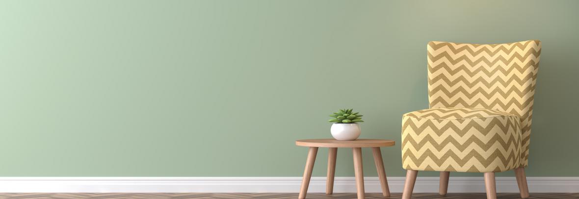
NEW YORK — “Quietly colorful” paint hues can provide homeowners with the pop of color they are looking for without the concern of choosing a paint color that is too bold. These colors are considered "in between" paint colors that are slightly muted that can make a statement without demanding attention.
These colors, such as Tissue Pink from Benjamin Moore, provide more depth and interest to a space than neutral colors. Benjamin Moore has launched the 2025 Color Trends palette with nine "quietly colorful" hues with rich undertones that provide a dynamic look as light levels shift during the day. Other colors in the palette include Cinnamon Slate, Sea Salt, Silver Marlin, Iced Lavender, Healing Aloe and Hazy Skies.
The subdued hues provide a background that highlights accessories or new statement pieces, allowing the room to evolve with the homeowner's tastes, according to interior designers.
For kitchens and mudrooms or even cabinets, interior designers recommend a soft, weathered blue with a touch of grey, like De Nimes from Farrow and Ball. Silver Marlin is recommended for walls or cabinets that need a touch of color, and designers say the touch of green and blue in the paint gives it a soothing quality.
Treron from Farrow & Ball is an excellent alternative to deep olive of sage tones and pairs well with warm woods, brass and limestone, working well in kitchens or hallways.
Bathrooms and bedrooms could do with a Healing Aloe for its calming green tones, while areas that need a little fun could be splashed with Iced Lavender, a less bold purple that still makes a statement.
Light Blue from Farrow and Ball can add just enough personality to a room and provides a shift in tone from blue to gray depending on the lighting. Pair Redend Point by Sherwin-Williams with millwork or cabinetry to provide a soft, depth with the warm clay tone, which works well in living spaces or kitchens, according to designers. Benjamin Moore's Hazy Skies also is a grayer blue that can provide calm to a space and accent any decor the homeowner chooses.
Source: Homes & Gardens (02/17/25) Moorman, Emily
© Copyright 2025 Smithbucklin